
Client
Microsoft through Aquent
Categories
Product Design - Cartography - UX/UI
Brief
Extend the family of products within Microsoft Edge to include a dedicated traffic destination experience
Approach
Over 16 months, I took this project from inception to development with the goal of increasing the number of users who visit Microsoft Edge for everyday tasks. My scope of work for this contract included product development, user task flows, prototypes, design sprints, and user studies.
The design process changed throughout the project and ranged from a typical product workflow to rapid development and testing
Product Background
Released in 2015, Microsoft Edge is a proprietary, cross-platform web browser created to be the successor to Internet Explorer. With such a diverse amount of utility and functionality, the browser's market share of users in the US has risen to 8.47%.
There are various experiences hosted within Edge such as weather, finance, sports, and gaming, that are meant to provide rich information to their users. During my time there, traffic was prioritized to be added to the system.
How to people get the information they need?
Content is consumed in a multitude of ways across the platform. Based on what the user wants to see, the experience contains 3 different methods for delivering. Going from glanceable to in depth, we have taskbar information, personalized cards for the users feed, and a full destination experience.

Team
Ashley, Justin, and Rijuta were essential in guiding the project while I developed the bulk of the experience. We worked rapidly and I frequently interfaced with a team of 26 developers to discuss feasibility, progress, and details.

Timeline

Conception: Traffic destination page & feed cards


Results
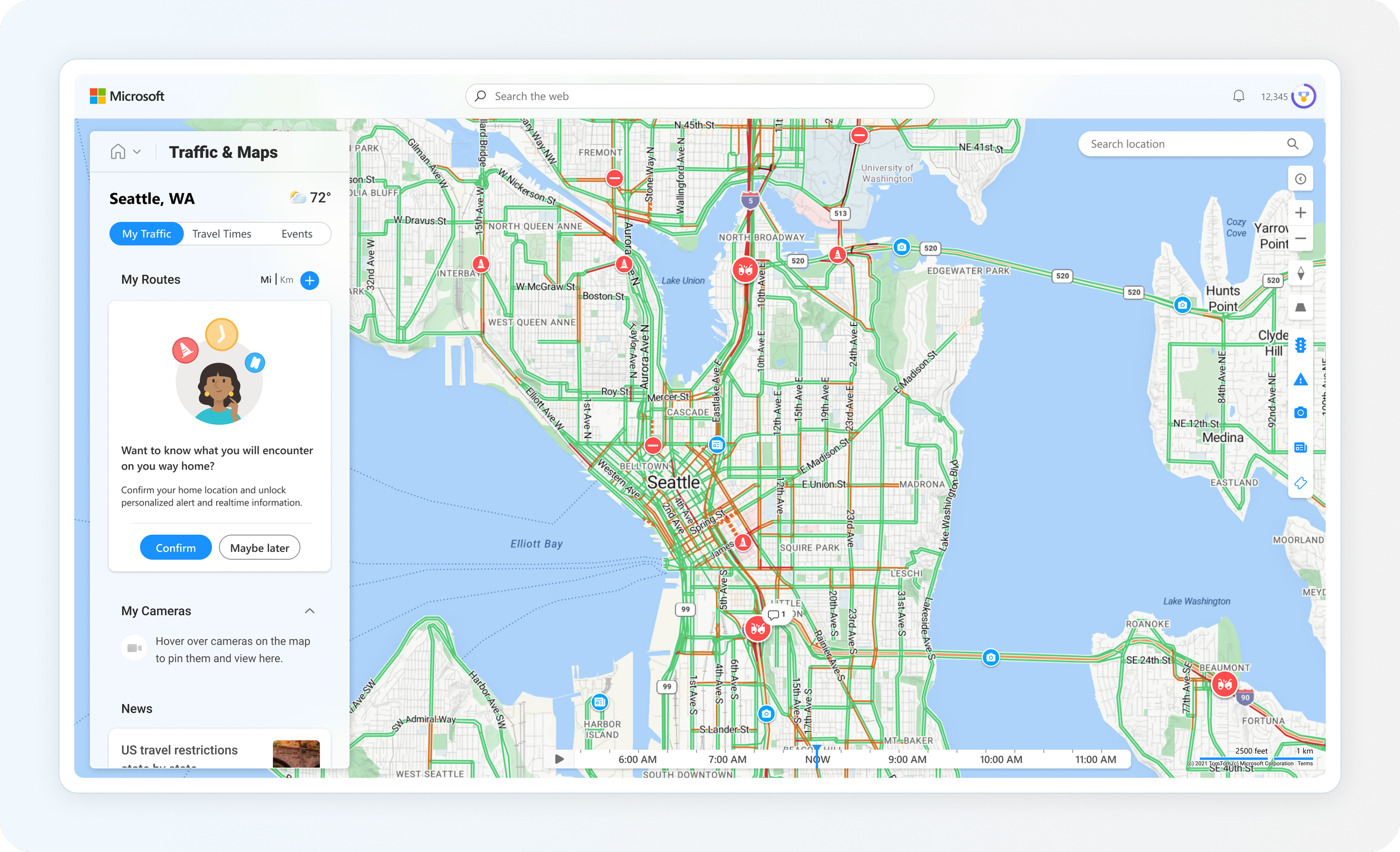
The proof of concept for the landing experience and cards was agreed upon, so I designed edge cases and various comps so developers could start working on the first iteration.
Sprints & Development
With a solid starting point, it was time to expand on what this experience could be elevated to. Two design sprints were scheduled to help move this product to the next step. The first sprint (A) was focused on product concepts and utility, while the second sprint (B) focused primarily on visual refinement.


This was quickly iterated on in time for a web experience share out with the CEO of Advertising & Web Services, Mikhail Parakhin. There was positive feedback, and we were given the green light to push forward with our new design. The only feedback was a request for a slight visual facelift.

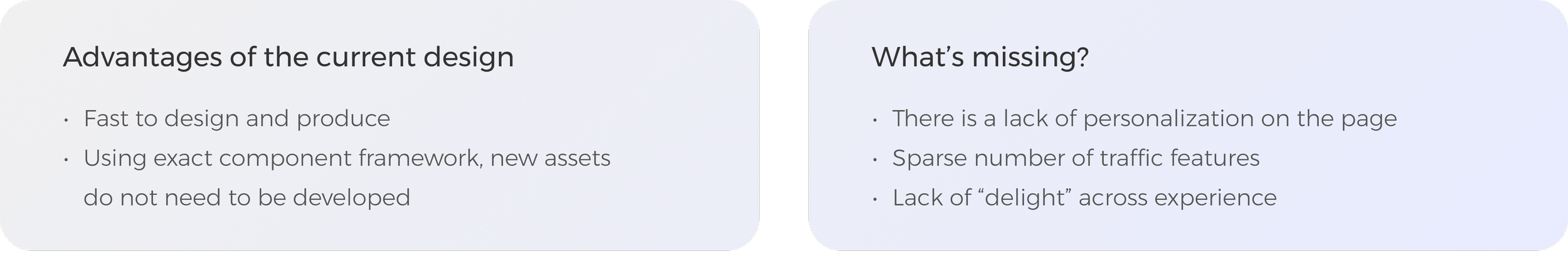
Prioritization
The visual updates were approved and our next steps were to regroup with the dev team and PM to go through a priority list of cost / feasibility for each feature. The P1’s were essential for our first flight. The P2's, although still important, would be designed later to add more personalization and delight to the page. In addition to the features, a new card set was prioritized as well.

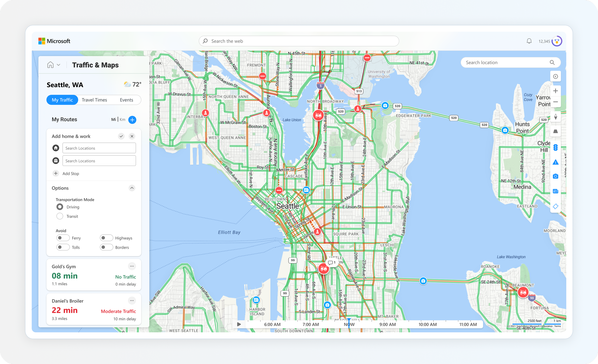
Task flows
With a solid plan established, I started getting into the traffic landing features with user task flows and sketches.


Process Comps
Below, I wanted to include an example of how I took these task flows and crafted them into compositions for developers. I make an effort to lay out the specs, scenarios, and edge cases so they are easy to translate into production. Unfortunately, I cannot include all of my processes due to the amount on file for each feature.


Results
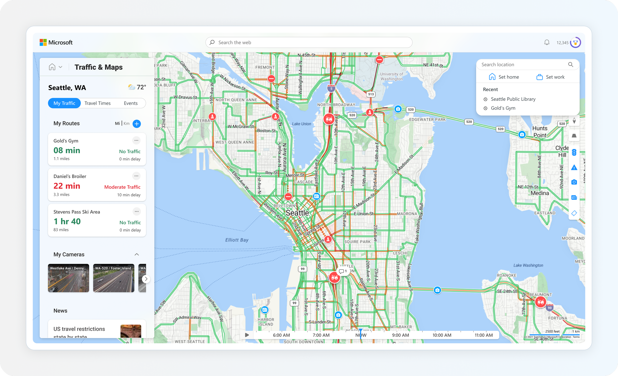
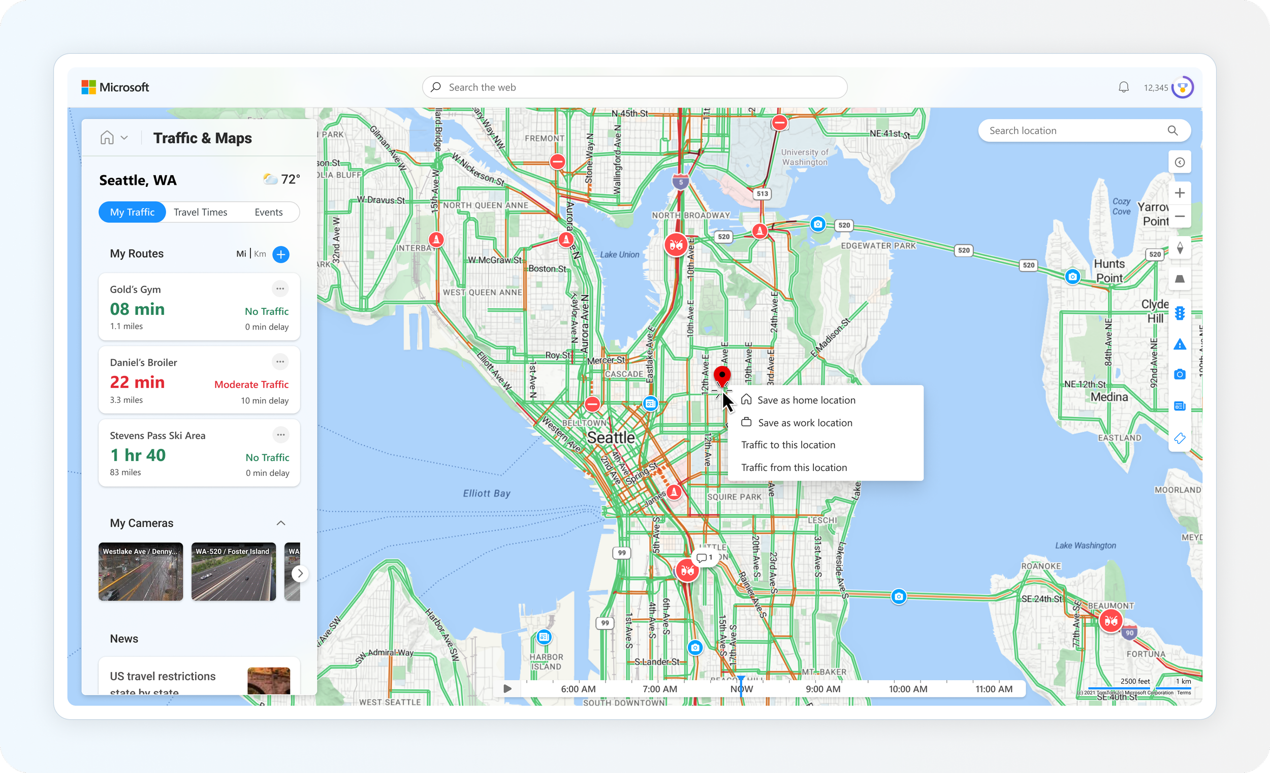
Here are a few of the final comps pulled from specific feature files, including our commute CTA, experience hub, route editing, and travel times.


New cards
With new personalized features and a map-centric experience, our entry point cards had to reflect recent developments. The previous set only contained traffic alerts, but we have expanded them into general traffic, travel times, traffic cameras, and a commute card.


Task Bar
With our card set expanded, it was time to move on to the smallest asset, the taskbar. At a glance, users are able to see if there are delays on major highways near their area or their current commute home or to work.

Developing a vision
The work was presented to the CVP of Design, Albert Shum. We received allocations for the work, and since the bulk of the experience was designed, we prioritized another product sprint. This time the goal was to push the boundaries, increase daily average users / clicks per view, and develop an experience where users come for traffic but can stay for more. To accomplish this, I thought about how we can alter our experience with a focus on the words below.

Areas of exploration: Commute
With commute being one of our most principal features, there was emphasis on developing more intuitive methods to acquire users home and work locations. I spent time designing various methods, ranging from explicit to implicit, to achieve it

Map updates
To drive user engagement and delight, I wanted to focus on elevating the current system of entity layers on the map. By providing different types of relevant content such as events, parking, and fuel locations, we will cover a larger scope of what is important to users while traveling.


Users stay for more
There was a large push from leadership to increase our user base while also instigating more clicks on the page. Considering news and events have an impact on traffic conditions, I wanted to expand our experience where these items are given map context but can still be viewed in a typical feed form.

A new series of cards
The traffic feed cards needed the same amount of focus, so I expanded our current set with the goals of providing real-time information and user delight.


User study
I created such a wide breadth of engaging cards that the team decided to bring them in front of the eyes of users to gauge interest. We gathered a series of questions, gathered the assets, and then worked with a group of users from Seattle and Boston. Asking questions such as:
Do you still commute to work? If so, how long is your typical commute?
How do you usually get information regarding traffic?
What are your thoughts on this card, and would you engage with it?


