
Sippin
Packaging Design

Brief
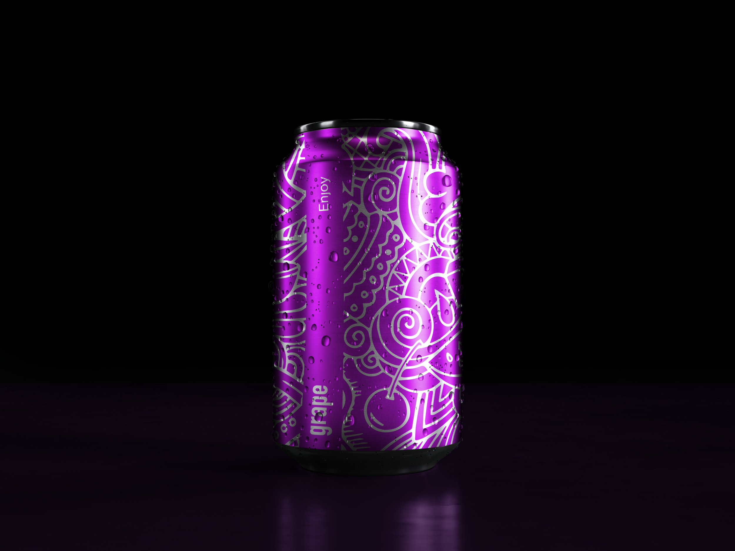
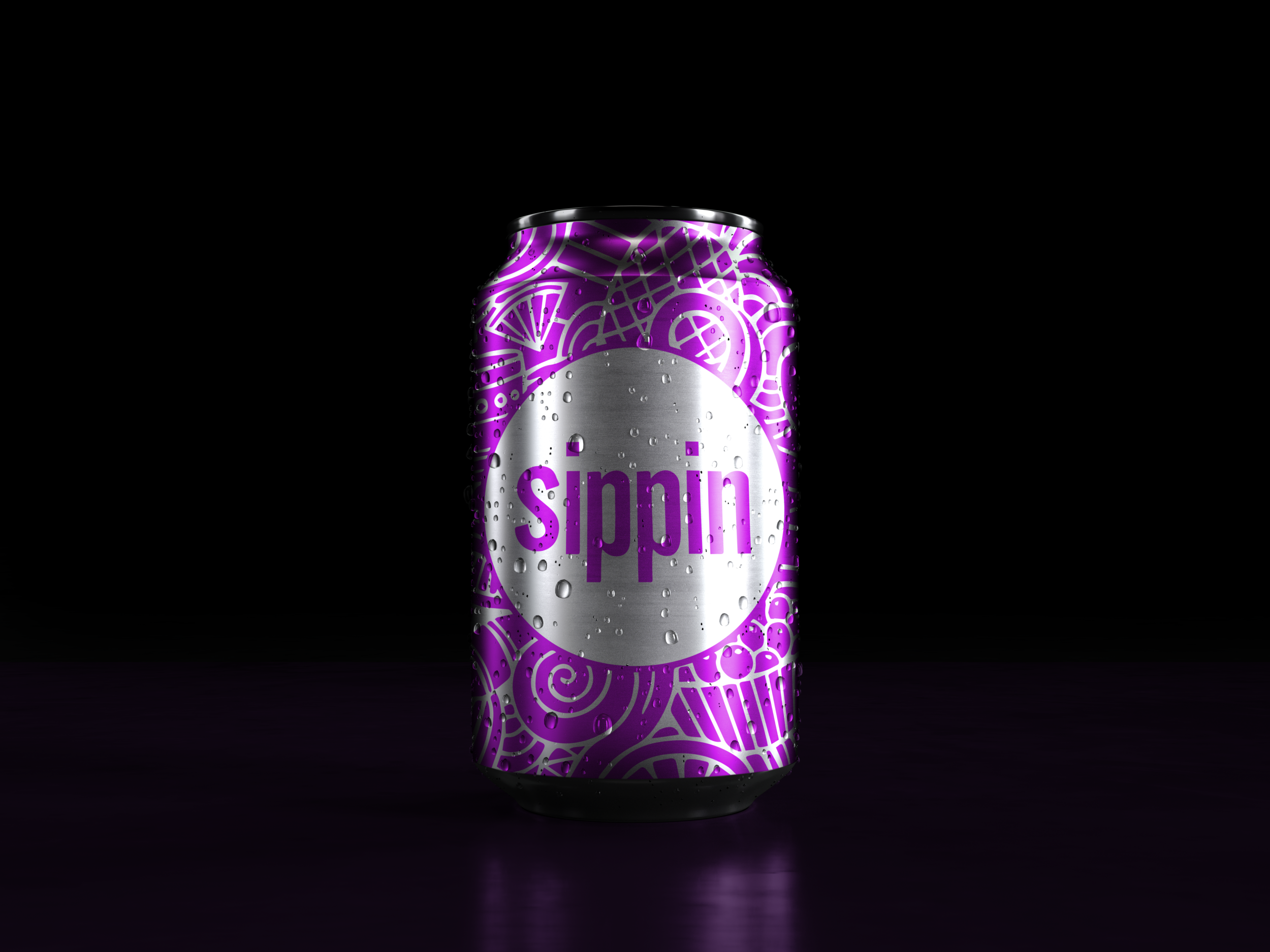
This is a soda brand that I thought up and my goal was to utilize the full surface area of the can. I wanted to make a product that is easily recognizable, feels like summer, and speaks for itself. The color of the ink corresponds with what flavor it is (grape, orange, lime, or cherry).


I wanted to try something a little different with this project so I experimented with screen printing on glass bottles. It was a difficult process but I managed to produce some pretty unique effects! I first flooded the screen with ink, flipped it over, then ever so gently rolled the bottles across the screen.


