Rodeo Donut

Brief
I was assigned to rebrand a donut shop in Seattle and my goal was to elevate the business and make it seem like they would be the best donuts in the city. inspired by western floral patterns, my logo reflects the complexity of the products the company serves.


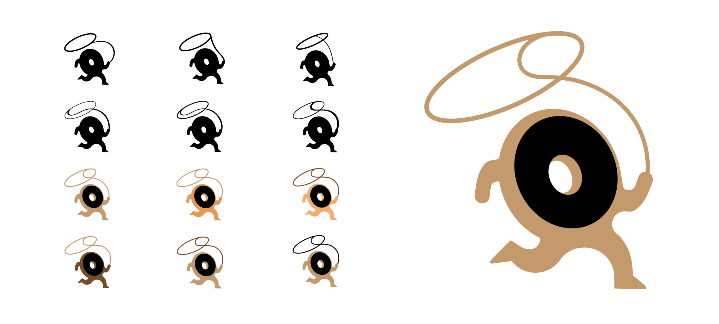
While working on this project, I felt like I was loosing some of the fun that is associated with donut shops. I decided to take a new approach that would appear more friendly and appeal to a younger audience. I started sketching simpler, more literal logos.


Refinements
Other Ideation